Y11as Ski Resort
Tekstiä tähän
Where we started
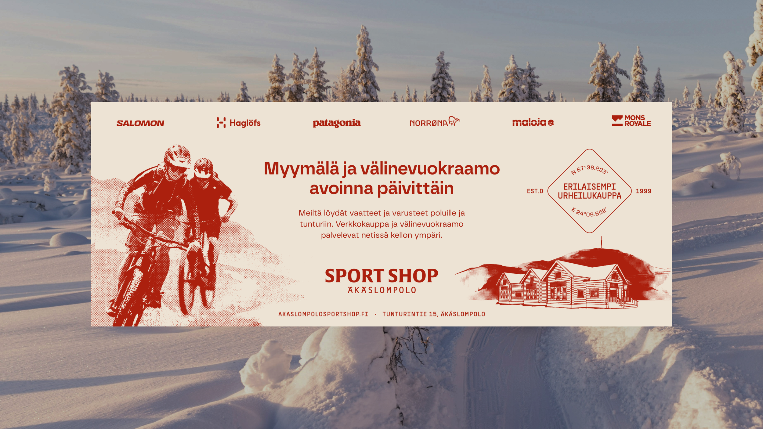
While we didn’t set out to do a complete overhaul of the old visuals, they did need a bit of freshening up. The stencil logo and overflowing layouts made the overall look somewhat messy, and while there were a couple of old illustrations, their style felt slightly too technical for the ‘classically stylish’ look & feel the client was looking for.
What we did
It was clear from the start that we should stick with the iconic red color palette in order to keep things recognisable. We redesigned the logo while still being careful not to take it too far from the original. We kept the old illustrations, but updated them with a simple rasterised texture to give them an aged, vintage look. As part of the final deliverable assets, we created a set of Photoshop effects with which practically any photo can be turned into a new ‘illustration’.
A few other key elements were given a light redesign, and finally the whole thing was built into a visual design system that is a perfect blend of the stylish class of a small-town country sport shop and the modern aesthetics of the high-performance brands that they represent.


