

Step into the vibrant world of Himan Hitit, chef Hanna Himanka's latest culinary adventure designed to make everyday cooking easy, delicious and loads of fun.

Starting point
Himan Hitit is more than just a service concept—it’s a game-changer in grocery shopping. Designed to simplify the customer’s journey, Himan Hitit and the Recipe Kiosk provide curated recipe cards that make meal planning effortless and shopping more intuitive. It offers practical everyday recipes, tips, recommendations, and inspiration — but instead of trying to reach home cooks through the internet and social media, it connects with them directly in the grocery store.
Our task was to create a distinctive and fresh visual concept that would leave a lasting impression. Hanna had a clear vision of the feeling she wanted; a playful visual identity that is super bright and bold, with colors that make the brand pop in the busy retail environment. She was confident that, in skilled hands, her idea would evolve into a strong and functional design.
With a limited budget, we needed to be strategic in our approach. We aimed to develop a design system that not only stood out but was also easy for Hanna to expand on her own — allowing her to create new materials effortlessly without requiring advanced design skills.

Idea
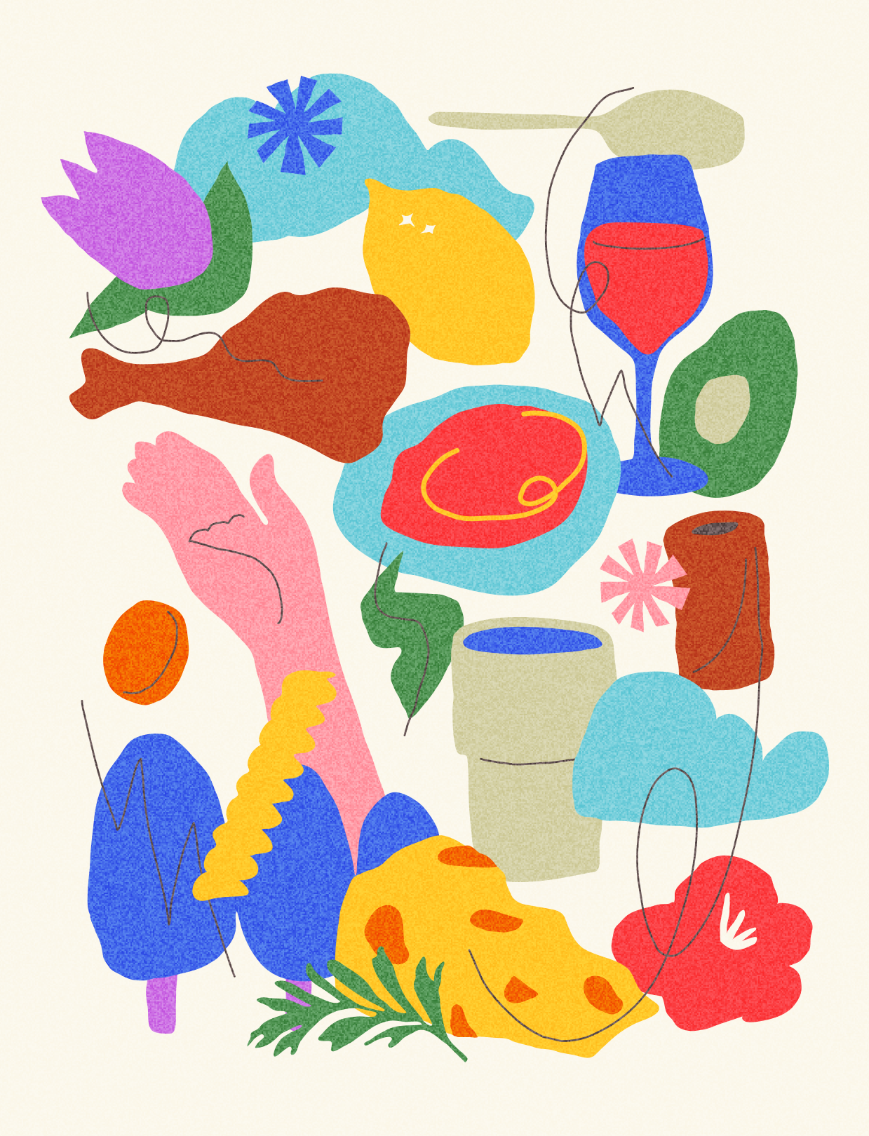
The visual identity is inspired by an everyday moment that everyone is familiar with; the rush of daily life when you return home from the store, unpack your grocery bag, and lay everything on the table before organizing it into the cupboards. It captures that brief, in-between state of movement and spontaneity, reflecting the natural chaos and rhythm of home cooking.
The overall vibe needed to be inviting yet bold — something that stands out but doesn’t overwhelm. It had to have enough personality to be memorable while still feeling approachable for everyday shoppers in the hectic grocery store environment.
To bring a cozy, homey feel to the identity, we drew inspiration from vintage recipe cards — those well-loved kitchen staples that many remember using themselves or watching their mothers cook from during childhood. These nostalgic touches add warmth and familiarity, combining past with present while keeping the look fresh and modern.
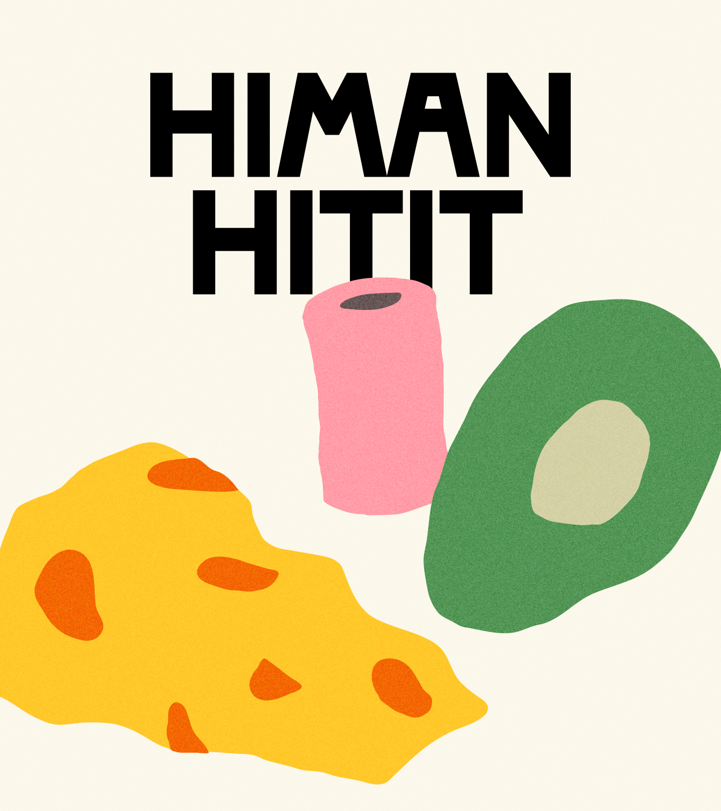
And let’s not forget that Himan Hitit offers its own recipe cards, making meal planning even easier! As a final playful nod to everyday grocery shopping, the logomark pays homage to the classic banana sticker — something small yet instantly recognizable to everyone.
Execution
The foundation of the visual identity is a simple yet dynamic composition of everyday grocery items that form a bold, versatile pattern. This pattern can be used as a whole or cropped into sections, offering flexibility while maintaining a cohesive look.
To reinforce the identity, we created a set of sticker-like mini groceries — playful, easily recognizable icons that instantly signal the Himan Hitit brand. These elements make the materials feel distinct and consistent. To add even more variety, we designed additional food illustrations that bring depth and character to the overall look.
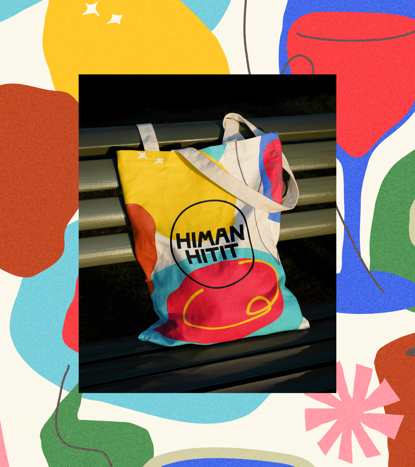
As part of the project, we also designed Himan Hitit recipe cards and a POS recipe kiosk, allowing shoppers to pick up a ready-made meal idea for the next day while browsing the store. To make everyday life even easier, we designed a handy shopping list filled with Hanna’s tried-and-true ingredient recommendations — helping customers stock their pantries with confidence. On top of that, we created a bunch of inspirational designs for Hanna to use across different touch points — whether it’s social media, in-store, or posters — ensuring the brand stays visually cohesive and instantly recognizable wherever it appears.


Results
In 2024, the pilot program launched in five grocery stores, distributing tens of thousands of recipe cards to consumers. The impact was immediate: the fresh and engaging visual identity stood out, sparked joy, and left a lasting impression on shoppers.
The branding wasn’t just seen—it was felt. It resonated with customers, making their shopping experience more enjoyable and memorable. Himan Hitit became a recognizable, loved, and effective tool in driving grocery sales and enhancing the in-store experience.
The bold, smart, and consumer-first visual identity for Himan Hitit is a testament to how design can transform the everyday into something exceptional.


Client: Himan Hitit
& Hanna Himanka
Design: Nordinary
Grand One Category:
Best Freelancer Work